Project Overview
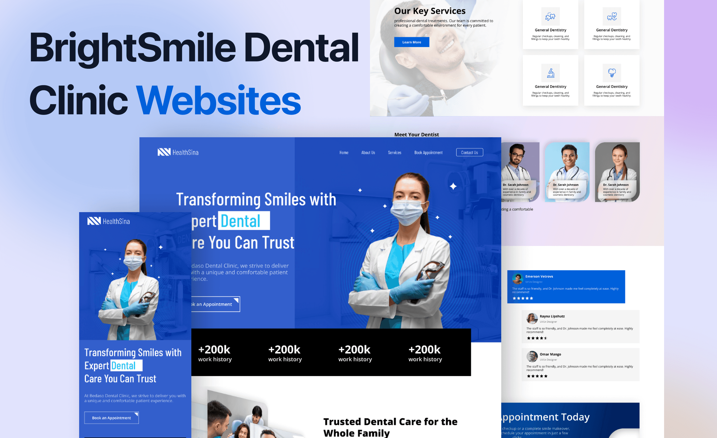
BrightSmile Dental Clinic is a modern, patient-focused practice offering general, cosmetic, and preventive dental care. The clinic combines professional service with a comfortable atmosphere to make dental treatment simple, stress-free, and accessible for all patients
BrightSmile Dental Clinic is a modern, patient-focused practice offering general, cosmetic, and preventive dental care. The clinic combines professional service with a comfortable atmosphere to make dental treatment simple, stress-free, and accessible for all patients
UI/UX Designer (Research → Wireframes → UI → Testing)
UI/UX Designer (Research → Wireframes → UI → Testing)
-Figma
-Slack
-Figma
-Slack
3 weeks
3 weeks
The Process
Problem Definition
Problem Definition
Problem Definition
Research & Insights
Research & Insights
Research & Insights
Solution Formula
Solution Formula
Solution Formula
Design Process
Design Process
Design Process
Prototype Testing
Prototype Testing
Prototype Testing
Final Outcome
Final Outcome
Final Outcome
Problem Statement
Problem Statement
Problem Statement
Background
Background
Going to the dentist is already something many people feel nervous about — the last thing they need is a confusing website standing in their way. For this clinic, the in-person experience was warm and professional, but the online journey told a different story. Patients struggled to find information, book appointments, or even figure out where the clinic was located. Instead of making their lives easier, the website often added another layer of stress.
Going to the dentist is already something many people feel nervous about — the last thing they need is a confusing website standing in their way. For this clinic, the in-person experience was warm and professional, but the online journey told a different story. Patients struggled to find information, book appointments, or even figure out where the clinic was located. Instead of making their lives easier, the website often added another layer of stress.
The Problem
The Problem
At its core, the problem wasn’t about the services themselves — the clinic was great at what they did. The problem was how people experienced the clinic online. Pages felt cluttered, details were hidden, and booking an appointment felt like a chore. Patients today expect digital experiences to be quick, clear, and supportive. Here, the opposite was happening. Potential patients were dropping off, current patients were frustrated, and the clinic’s reputation wasn’t shining through in the way it deserved.
At its core, the problem wasn’t about the services themselves — the clinic was great at what they did. The problem was how people experienced the clinic online. Pages felt cluttered, details were hidden, and booking an appointment felt like a chore. Patients today expect digital experiences to be quick, clear, and supportive. Here, the opposite was happening. Potential patients were dropping off, current patients were frustrated, and the clinic’s reputation wasn’t shining through in the way it deserved.
Who is Affected
Who is Affected
People looking for their first appointment, who often give up after struggling with the website.
People looking for their first appointment, who often give up after struggling with the website.
Returning patients, who just want a simple way to rebook but end up calling instead.
Returning patients, who just want a simple way to rebook but end up calling instead.
Clinic staff, who spend hours answering the same basic questions that the website should have covered.
Clinic staff, who spend hours answering the same basic questions that the website should have covered.
Ultimately, the business itself, which loses trust, time, and new opportunities every day the problem isn’t fixed.
Ultimately, the business itself, which loses trust, time, and new opportunities every day the problem isn’t fixed.
Research
Research
Research
Competitive Analysis
Competitive Analysis
I compared four competitor websites — looking at their target patients, strengths, weaknesses, and key features — to find gaps and opportunities for our clinic.
I compared four competitor websites — looking at their target patients, strengths, weaknesses, and key features — to find gaps and opportunities for our clinic.
Competitive Name
Competitive Name
Atlanta Center for Advanced Periodontics
Atlanta Center for Advanced Periodontics

Grand Street Dental
Grand Street Dental

Petite Smiles Boutique Pediatric Dentistry
Petite Smiles Boutique Pediatric Dentistry
Target Patients
Target Patients
General public
General public
High-end clients
High-end clients
Young professionals
Young professionals
Families with children
Families with children
Weaknesses
Not tailored for families, limited premium feel
Not tailored for families, limited premium feel
Navigation can feel impersonal, some info buried
Navigation can feel impersonal, some info buried
Limited family/kid-friendly content
Limited family/kid-friendly content
Only pediatric services, limited adult info
Only pediatric services, limited adult info
Strengths
Simple navigation, clear visuals, easy to read
Simple navigation, clear visuals, easy to read
Elegant, premium look, professional photography
Elegant, premium look, professional photography
Fast booking flow, modern and simple layout
Fast booking flow, modern and simple layout
Child-friendly visuals, easy service descriptions
Child-friendly visuals, easy service descriptions
Online Booking
Online Booking
Service Details
Service Details
Mobile Friendly
Mobile Friendly
Live Chat
Live Chat
Blog/Education
Blog/Education
Location Info
Location Info
Live Chat
Live Chat
Modern Design
Modern Design
Multiple Branch Support
Multiple Branch Support
Competitive Name
Smile Design Studio
Atlanta Center for Advanced Periodontics
Grand Street Dental
Petite Smiles Boutique Pediatric Dentistry
Target Patients
General public
High-end clients
Young professionals
Families with children
Weaknesses
Not tailored for families, limited premium feel
Navigation can feel impersonal, some info buried
Limited family/kid-friendly content
Only pediatric services, limited adult info
Strengths
Simple navigation, clear visuals, easy to read
Elegant, premium look, professional photography
Fast booking flow, modern and simple layout
Child-friendly visuals, easy service descriptions
Online Booking
Service Details
Mobile Friendly
Live Chat
Blog/Education
Location Info
Live Chat
Modern Design
Multiple Branch Support
User Interviews
User Interviews
Source
I conducted user interviews by reaching out to real patients via social media platforms and online dental communities. This helped gather honest feedback from people who actually use dental websites to book appointments or find information.
I conducted user interviews by reaching out to real patients via social media platforms and online dental communities. This helped gather honest feedback from people who actually use dental websites to book appointments or find information.
Key Questions
How easy was it to find the services you needed online?
How easy was it to find the services you needed online?
Did you face any difficulties booking an appointment through the website?
Did you face any difficulties booking an appointment through the website?
What would make the online experience more convenient for you?
What would make the online experience more convenient for you?
This is what I found
Many users said they struggled to locate specific services quickly and often had to call the clinic.
Many users said they struggled to locate specific services quickly and often had to call the clinic.
Some mentioned that online booking was confusing or incomplete, causing frustration.
Some mentioned that online booking was confusing or incomplete, causing frustration.
Users suggested clearer navigation, visible pricing, and mobile-friendly layouts to make the experience smoother.
Users suggested clearer navigation, visible pricing, and mobile-friendly layouts to make the experience smoother.
A few noted that they wanted to see reviews or testimonials from other patients to feel more confident in choosing a service.
A few noted that they wanted to see reviews or testimonials from other patients to feel more confident in choosing a service.
User Personas
User Personas

Daniel Thompson
Daniel Thompson
Age: 32
Age: 32
Status: Single
Status: Single
Occupation: Marketing Specialist
Occupation: Marketing Specialist
Personality:
Personality:
Busy
Busy
ech-savvy
ech-savvy
Thinker
Thinker
Bio
Bio
“Daniel works long hours in a fast-paced marketing job. He rarely has time to visit the dentist, so he relies heavily on online information and booking systems to manage appointments quickly.”
Goals
Goals
Find a dental clinic with easy online booking.
Find a dental clinic with easy online booking.
Quickly access information about services and pricing.
Quickly access information about services and pricing.
Schedule appointments that fit his busy work schedule.
Schedule appointments that fit his busy work schedule.
Access all booking details in one place.
Access all booking details in one place.
Frustrations
Frustrations
Websites with confusing navigation or incomplete service details.
Websites with confusing navigation or incomplete service details.
Online booking forms that are slow or unclear.
Online booking forms that are slow or unclear.
Lack of mobile-friendly interfaces, making it hard to book on the go.
Lack of mobile-friendly interfaces, making it hard to book on the go.
Daniel Thompson
Age: 32
Status: Single
Occupation: Marketing Specialist
Personality:
Busy
ech-savvy
Thinker
Bio
“Daniel works long hours in a fast-paced marketing job. He rarely has time to visit the dentist, so he relies heavily on online information and booking systems to manage appointments quickly.”
Goals
Find a dental clinic with easy online booking.
Quickly access information about services and pricing.
Schedule appointments that fit his busy work schedule.
Access all booking details in one place.
Frustrations
Websites with confusing navigation or incomplete service details.
Online booking forms that are slow or unclear.
Lack of mobile-friendly interfaces, making it hard to book on the go.

Sarah Williams
Sarah Williams
Age: 28
Age: 28
Status: Married, mother of one
Status: Married, mother of one
Occupation: Elementary School Teacher
Occupation: Elementary School Teacher
Personality:
Personality:
Caring
Caring
family-focused
family-focused
organized
organized
Bio
Bio
“Sarah balances teaching and caring for her young child. She wants a dental clinic that can accommodate her family’s needs, provide clear guidance online, and make appointments simple for both herself and her child”
Goals
Goals
Find a family-friendly clinic with clear service explanations.
Find a family-friendly clinic with clear service explanations.
Access reviews and testimonials to feel confident in choosing care.
Access reviews and testimonials to feel confident in choosing care.
Easily book appointments for herself and her child in one go.
Easily book appointments for herself and her child in one go.
Frustrations
Frustrations
Websites that don’t show pediatric services or family options.
Websites that don’t show pediatric services or family options.
Confusing or slow booking systems.
Confusing or slow booking systems.
Lack of trust signals or patient reviews, making it hard to decide which clinic to choose.
Lack of trust signals or patient reviews, making it hard to decide which clinic to choose.
Sarah Williams
Age: 28
Status: Married, mother of one
Occupation: Elementary School Teacher
Personality:
Caring
family-focused
organized
Bio
“Sarah balances teaching and caring for her young child. She wants a dental clinic that can accommodate her family’s needs, provide clear guidance online, and make appointments simple for both herself and her child”
Goals
Find a family-friendly clinic with clear service explanations.
Access reviews and testimonials to feel confident in choosing care.
Easily book appointments for herself and her child in one go.
Frustrations
Websites that don’t show pediatric services or family options.
Confusing or slow booking systems.
Lack of trust signals or patient reviews, making it hard to decide which clinic to choose.
Define
Define
Define
Checking Project Goals
Checking Project Goals
To create a successful product, we carefully analyze both user goals and business goals, then combine them into clear project goals. This ensures our design meets real user needs while supporting the business strategy.
To create a successful product, we carefully analyze both user goals and business goals, then combine them into clear project goals. This ensures our design meets real user needs while supporting the business strategy.
User Goals
User Goals
User Goals
Quickly find services and pricing without confusion
Quickly find services and pricing without confusion
Quickly find services and pricing without confusion
Easily book an appointment online (especially on mobile)
Easily book an appointment online (especially on mobile)
Easily book an appointment online (especially on mobile)
Access trustworthy reviews and testimonials before choosing
Access trustworthy reviews and testimonials before choosing
Access trustworthy reviews and testimonials before choosing
Have family-friendly options and clear service explanations
Have family-friendly options and clear service explanations
Have family-friendly options and clear service explanations
Project Goals
Project Goals
Project Goals
Create a user-friendly website with clear navigation
Create a user-friendly website with clear navigation
Create a user-friendly website with clear navigation
Present services and expertise in a professional way
Present services and expertise in a professional way
Present services and expertise in a professional way
Build trust with a clean, modern design
Build trust with a clean, modern design
Build trust with a clean, modern design
Provide an easy and efficient appointment system
Provide an easy and efficient appointment system
Provide an easy and efficient appointment system
Business Goals
Business Goals
Business Goals
Improve appointment conversion rates through the website
Improve appointment conversion rates through the website
Improve appointment conversion rates through the website
Build trust and credibility with a modern, professional design
Build trust and credibility with a modern, professional design
Build trust and credibility with a modern, professional design
Reduce the need for phone calls by making online booking seamless
Reduce the need for phone calls by making online booking seamless
Reduce the need for phone calls by making online booking seamless
Attract both new patients and retain loyal ones across demographics
Attract both new patients and retain loyal ones across demographics
Attract both new patients and retain loyal ones across demographics
Problem statements & hypotheses
Problem statements & hypotheses
Based on interviews and research to understand the goals, needs and the pain points of the users.
Based on interviews and research to understand the goals, needs and the pain points of the users.
Patients struggle to find clear information about dental services and pricing.
Patients struggle to find clear information about dental services and pricing.
Patients struggle to find clear information about dental services and pricing.
The appointment booking process is long and inconvenient.
The appointment booking process is long and inconvenient.
The appointment booking process is long and inconvenient.
Mobile users find most dental websites hard to navigate on small screens.
Mobile users find most dental websites hard to navigate on small screens.
Mobile users find most dental websites hard to navigate on small screens.
New visitors cannot easily learn about the doctors and their qualifications.
New visitors cannot easily learn about the doctors and their qualifications.
New visitors cannot easily learn about the doctors and their qualifications.
Patients often feel anxious about dental visits and want reassurance.
Patients often feel anxious about dental visits and want reassurance.
Patients often feel anxious about dental visits and want reassurance.
If we organize services and pricing clearly, patients will make decisions faster and book more confidently.
If we organize services and pricing clearly, patients will make decisions faster and book more confidently.
If we organize services and pricing clearly, patients will make decisions faster and book more confidently.
If we create a simple 3-step booking form, more patients will complete online appointments.
If we create a simple 3-step booking form, more patients will complete online appointments.
If we create a simple 3-step booking form, more patients will complete online appointments.
If we build a responsive, mobile-friendly site, patients will stay longer and interact more.
If we build a responsive, mobile-friendly site, patients will stay longer and interact more.
If we build a responsive, mobile-friendly site, patients will stay longer and interact more.
If we showcase doctor profiles and certifications, patients will trust HealthSina more.
If we showcase doctor profiles and certifications, patients will trust HealthSina more.
If we showcase doctor profiles and certifications, patients will trust HealthSina more.
If we include patient testimonials and a “What to Expect” section, patients will feel less anxious and more willing to book.
If we include patient testimonials and a “What to Expect” section, patients will feel less anxious and more willing to book.
If we include patient testimonials and a “What to Expect” section, patients will feel less anxious and more willing to book.
Ideate
Ideate
Ideate
Information Architecture
Information Architecture
The Information Architecture defines how content is structured and organized across the website. It acts as a blueprint, showing the hierarchy of pages and the connections between them. By mapping out this structure, we ensure users can easily find what they’re looking for while keeping the navigation simple and intuitive.
The Information Architecture defines how content is structured and organized across the website. It acts as a blueprint, showing the hierarchy of pages and the connections between them. By mapping out this structure, we ensure users can easily find what they’re looking for while keeping the navigation simple and intuitive.
This step helps balance user needs with business priorities by placing the most important pages (such as Services and Appointments) within quick reach, while also creating a logical flow that supports smooth exploration of the site.
This step helps balance user needs with business priorities by placing the most important pages (such as Services and Appointments) within quick reach, while also creating a logical flow that supports smooth exploration of the site.
User Flow
User Flow
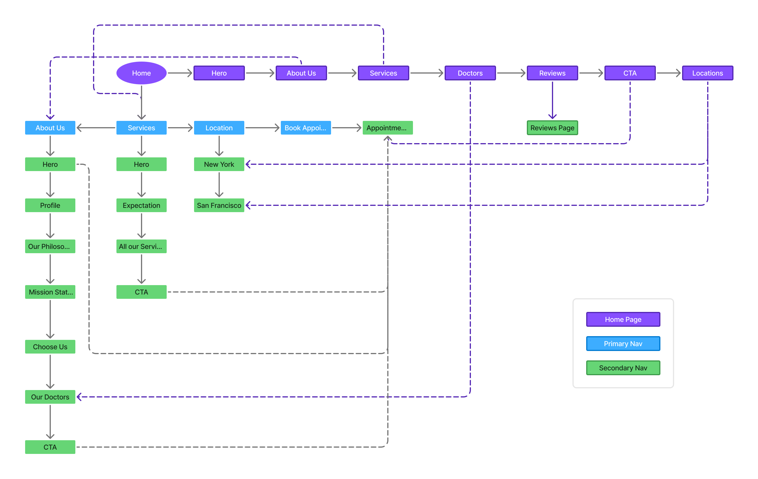
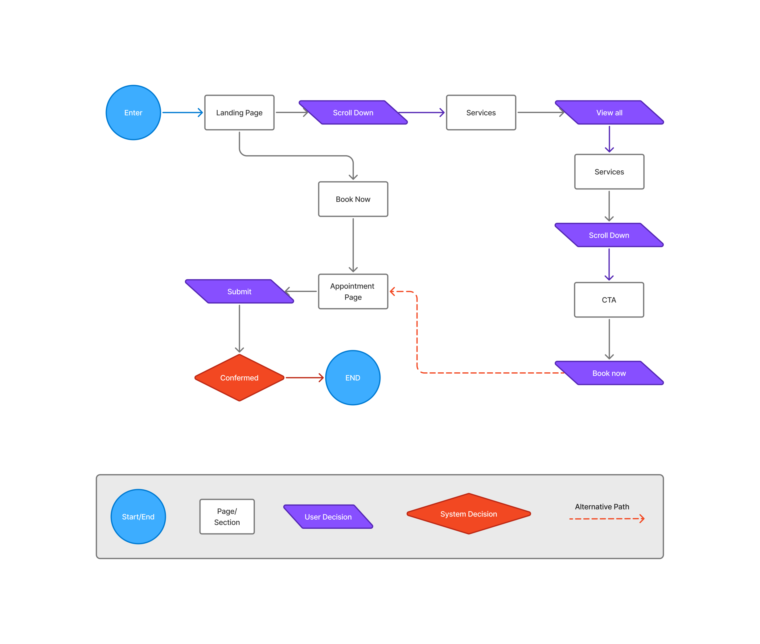
This user flow shows how people move through the site — from landing on the homepage, exploring services, and then booking an appointment. It maps both browsing steps and action steps so the journey feels smooth, clear, and focused on getting users to their goal.
This user flow shows how people move through the site — from landing on the homepage, exploring services, and then booking an appointment. It maps both browsing steps and action steps so the journey feels smooth, clear, and focused on getting users to their goal.
Wireframe
Wireframe
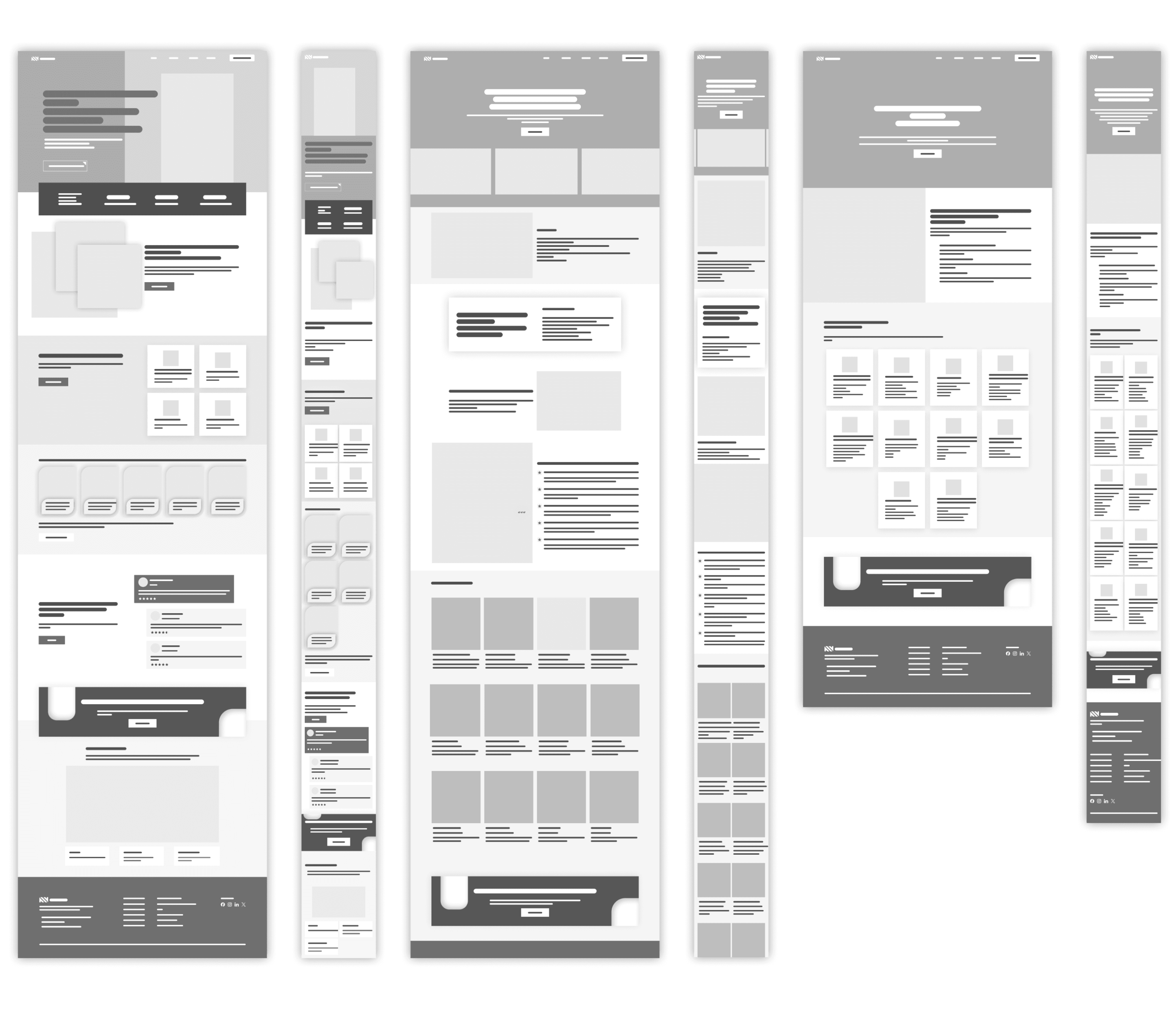
Our wireframes serve as the blueprint of the website, focusing on structure, layout, and functionality before diving into visuals. By stripping away colors and detailed designs, the wireframes highlight how users will navigate, where key elements will be placed, and how the overall experience will flow. This stage ensures clarity, alignment with user needs, and a strong foundation for the final design.
Our wireframes serve as the blueprint of the website, focusing on structure, layout, and functionality before diving into visuals. By stripping away colors and detailed designs, the wireframes highlight how users will navigate, where key elements will be placed, and how the overall experience will flow. This stage ensures clarity, alignment with user needs, and a strong foundation for the final design.
Ui Design
Ui Design
Ui Design
Introduction
Introduction
The UI design stage brings the structure of the wireframes to life. The focus was on creating a calm, professional, and approachable look that builds trust while staying easy to navigate. Clean layouts, soft colors, and clear call-to-action buttons guide patients smoothly from exploring services to booking an appointment. The design reflects both the clinic’s credibility and the warmth needed to make patients feel at ease.
The UI design stage brings the structure of the wireframes to life. The focus was on creating a calm, professional, and approachable look that builds trust while staying easy to navigate. Clean layouts, soft colors, and clear call-to-action buttons guide patients smoothly from exploring services to booking an appointment. The design reflects both the clinic’s credibility and the warmth needed to make patients feel at ease.
Design System
Design System
Color palette
Color palette
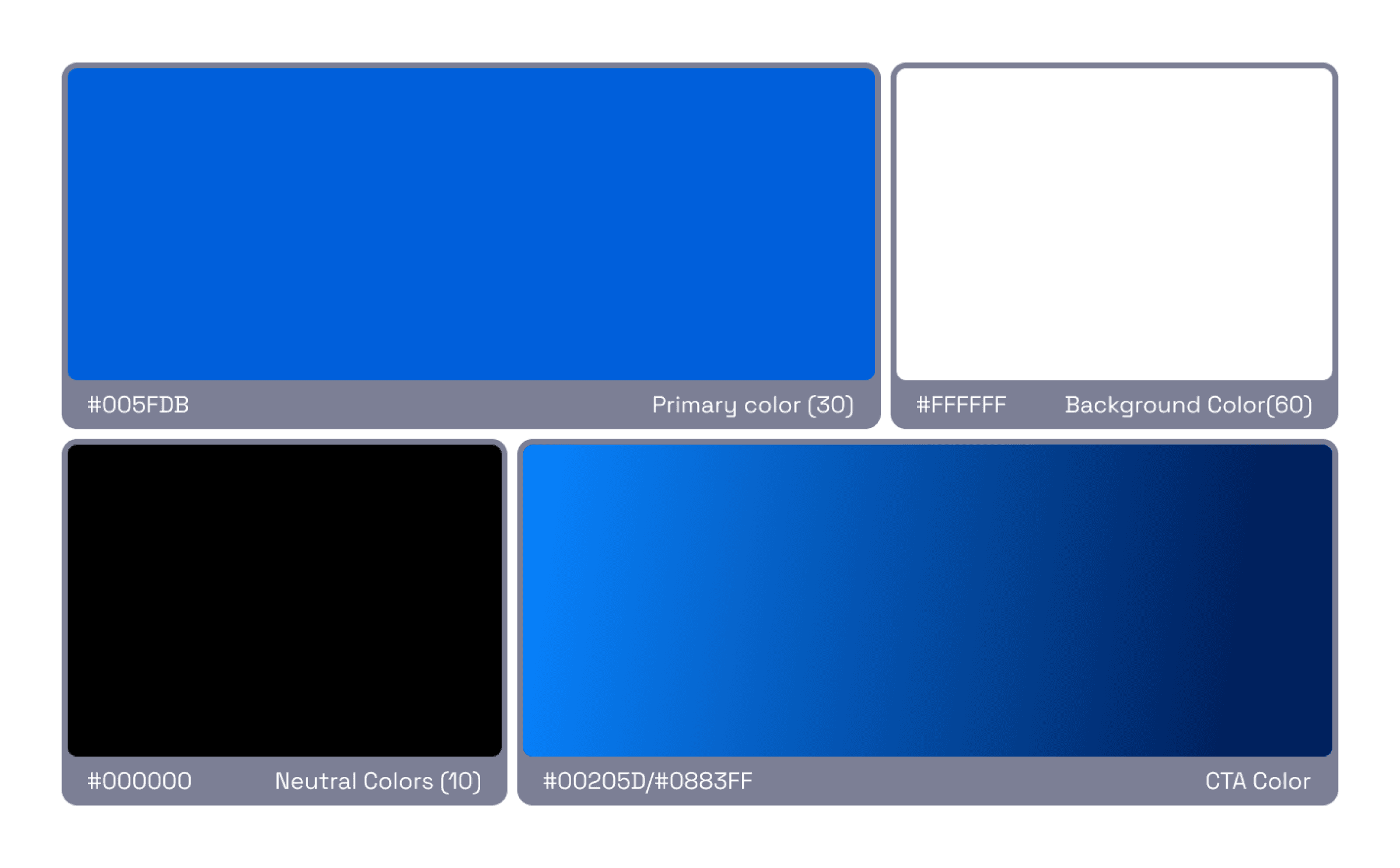
The color scheme uses calming blues and whites to reflect trust and cleanliness, with accent colors for highlights and CTAs.
The color scheme uses calming blues and whites to reflect trust and cleanliness, with accent colors for highlights and CTAs.
Typography
Typography
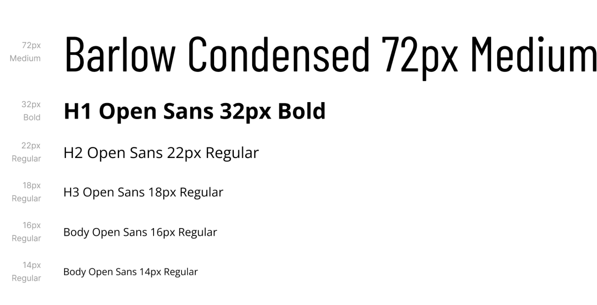
We chose a clean, modern typeface to ensure readability and professionalism. The hierarchy uses larger bold fonts for headings and lighter fonts for body text
We chose a clean, modern typeface to ensure readability and professionalism. The hierarchy uses larger bold fonts for headings and lighter fonts for body text
UI Elements
UI Elements
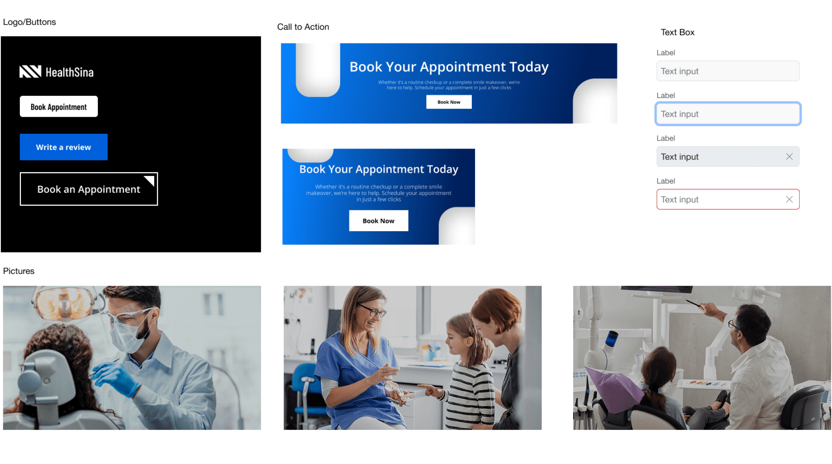
Custom icons and rounded buttons were designed to maintain consistency and enhance user interaction.
Custom icons and rounded buttons were designed to maintain consistency and enhance user interaction.
High-Fidelity Screens
High-Fidelity Screens
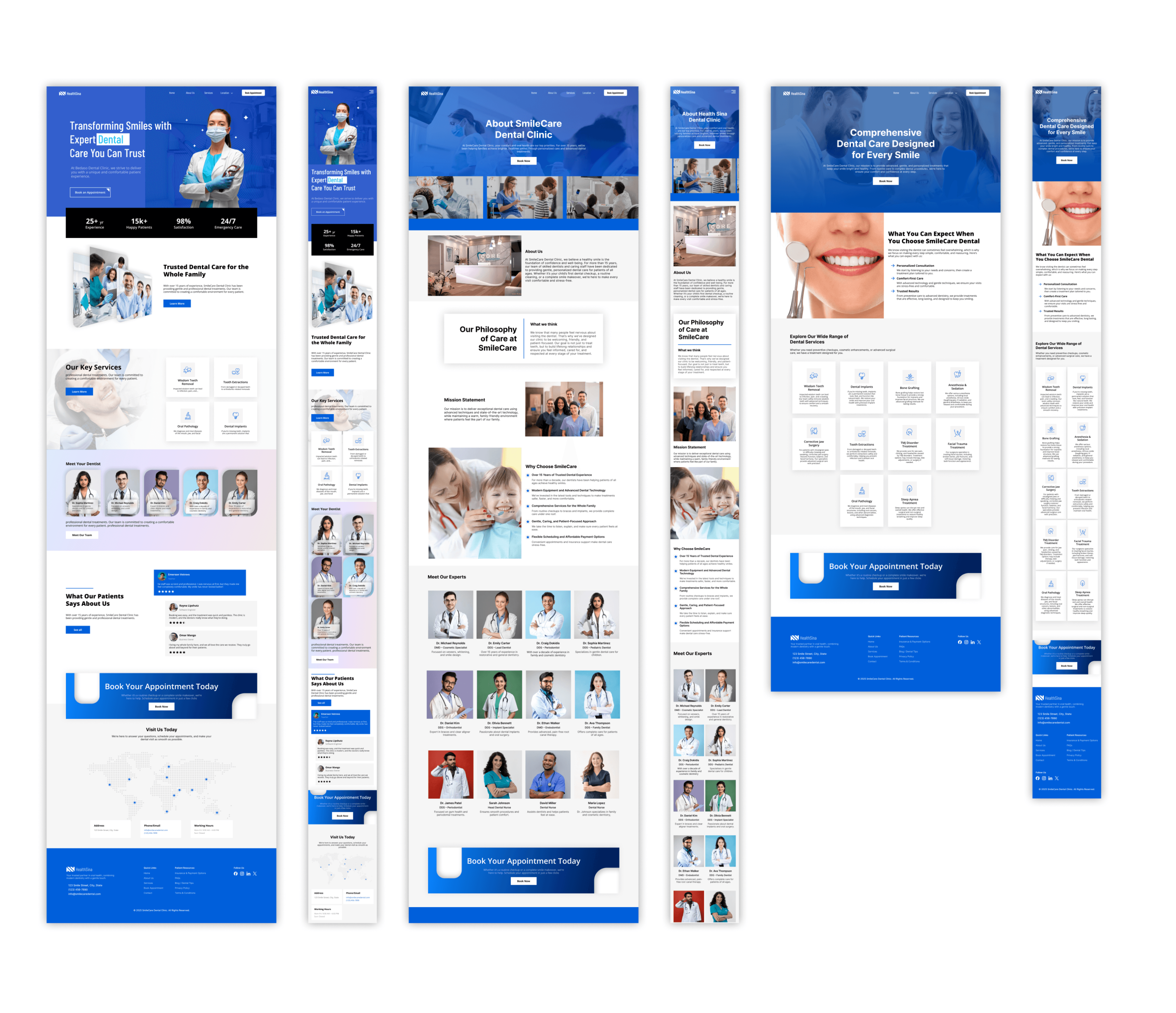
The high-fidelity designs translate research and structure into polished interfaces. Each screen emphasizes clarity and smooth navigation:
The high-fidelity designs translate research and structure into polished interfaces. Each screen emphasizes clarity and smooth navigation:
Home Page: Welcoming hero, clear service highlights, and easy appointment access
Home Page: Welcoming hero, clear service highlights, and easy appointment access
Services Page: Structured cards for treatments with quick action links
Services Page: Structured cards for treatments with quick action links
About Us Page: Friendly doctor profiles and approachable brand story
About Us Page: Friendly doctor profiles and approachable brand story
Appointment Page: Step-by-step booking form with progress indicators
Appointment Page: Step-by-step booking form with progress indicators
Reviews Page: Clean layout showcasing testimonials with CTA buttons
Reviews Page: Clean layout showcasing testimonials with CTA buttons
Location Page: Simple city-based navigation with maps, branch details, and direct booking links
Location Page: Simple city-based navigation with maps, branch details, and direct booking links
Usability Test
Usability Test
Usability Test
Objective
Objective
The purpose of this usability test was to evaluate how real users interact with the dental clinic website prototype. The main goal was to identify pain points, ensure smooth navigation, and check if users can quickly complete key tasks such as booking an appointment, finding services, and locating clinic contact information.
The purpose of this usability test was to evaluate how real users interact with the dental clinic website prototype. The main goal was to identify pain points, ensure smooth navigation, and check if users can quickly complete key tasks such as booking an appointment, finding services, and locating clinic contact information.
Methodology
Methodology
To make sure the design was tested in a realistic way, I conducted a small usability study with five participants representing different user groups (students, young professionals, and parents). The test was done remotely using the clickable high-fidelity prototype. Each participant was asked to perform three core tasks: booking an appointment, exploring a dental service, and finding the clinic’s contact information. While completing these tasks, I observed how long it took, where they hesitated, and what caused confusion. This helped me measure not only task completion but also the overall ease of navigation and satisfaction with the design.
To make sure the design was tested in a realistic way, I conducted a small usability study with five participants representing different user groups (students, young professionals, and parents). The test was done remotely using the clickable high-fidelity prototype. Each participant was asked to perform three core tasks: booking an appointment, exploring a dental service, and finding the clinic’s contact information. While completing these tasks, I observed how long it took, where they hesitated, and what caused confusion. This helped me measure not only task completion but also the overall ease of navigation and satisfaction with the design.
Findings & Improvements
Findings & Improvements
Finding 1: Users struggled to notice the “Book Now” button at first.
Finding 1: Users struggled to notice the “Book Now” button at first.
Improvement: Made the button larger, with a brighter color.
Improvement: Made the button larger, with a brighter color.
Finding 2: Some users expected service descriptions to have images/icons.
Finding 2: Some users expected service descriptions to have images/icons.
Improvement: Added icons and short summaries under each service.
Improvement: Added icons and short summaries under each service.
Finding 3: Users liked the clean layout but wanted quicker access to contact info.
Finding 3: Users liked the clean layout but wanted quicker access to contact info.
Improvement: Added a fixed footer with phone number and address.
Improvement: Added a fixed footer with phone number and address.
Final Outcome
Final Outcome
Final Outcome
Final Outcome
Final Outcome
After several iterations of research, design, and testing, the dental clinic website came together as a modern, user-friendly platform. The final design focuses on making essential actions—like booking an appointment, browsing services, or finding the clinic’s location—simple and intuitive. The interface feels professional yet welcoming, ensuring patients of all ages can navigate with ease.
After several iterations of research, design, and testing, the dental clinic website came together as a modern, user-friendly platform. The final design focuses on making essential actions—like booking an appointment, browsing services, or finding the clinic’s location—simple and intuitive. The interface feels professional yet welcoming, ensuring patients of all ages can navigate with ease.
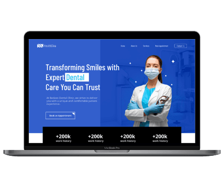
A clean and easy-to-navigate desktop design.
A clean and easy-to-navigate desktop design.
View Full Prototype
View Full Prototype
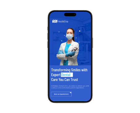
A simple, on-the-go version for quick access.
A simple, on-the-go version for quick access.
View Full Prototype
View Full Prototype